

UX Design: VAIN Database
Summary.
For our final project, our professor tasked us with designing the front end for a Victorian literature database. He noted that browsing should be considered the most important feature, but not browsing of the books --- browsing of the metadata.
This
Role: UX Designer
Team: Individual Project
Methods/Skills: comparative analysis, wireframing, design system creation, design ideation, prototyping
Scope: November - December 2022
Goal: Design the front end of the Victorian Autobiography Information Network (a literature database)

This
Design Process.
Initial Research.
The most difficult part of this project was trying to understand what exactly the client (my professor) wanted us to design. I had never had to design for something that I felt I had not seen an example of before. When he told us the most important thing about the literature database website should be browsing, I didn’t consider that he meant anything but browsing for books. This initial understanding led me to reaching out to literature scholars and librarians to interview. Our professor also suggested looking at B&H Photo Video for inspiration.
This
My Initial Research Included:
interviewing literature scholars about how they do research
reach out to librarians about what different interfaces look like for different levels of a website/database
looking at websites that are focused on browsing (e-commerce and research databases)
Browsing Examples


Interview Findings

User Level Differences
Improved Research.
However, after my first few designs and as the class was able to ask more questions about the project, it became clear that browsing for the books themselves was not the type of browsing he wanted us to worry so much about. After a sort of confusing class discussion, he said something that finally sparked the creative part of my brain. He called it a digital humanities project. This led me to looking up digital humanities projects to draw inspiration from.
This
My Improved Research Included:
researching different types of digital humanities projects
researching visualization examples
comparative analysis of Google Books and HathiTrust (real VAIN database is partnering with HathiTrust)

Digital Humanities Projects

Visualization Examples

Comparative Analysis
Problem Definition.
As a Victorian scholar, I’d like to be able to search through the metadata of the Victorian Autobiography Information Network (VAIN) and look for patterns or answer quantitative questions, while also being able to access the literature itself.
This
Design Ideation.
There was very little direction about what flows we should show. All that was known was that we should focus on browsing and should show the editing interface at some level.
This
The features we decided to focus on:
browsing metadata
filtering abilities, visualizations
browsing literature itself
important to be able to see the literature itself and see data of specific books
canned questions
offer as a sort of tutorial to show what types of questions could be answered by the website
editing literature data
the directions stated that the website should have four different user levels and the second level and down would have access to a menu interface for editing metadata of literature
Design System Research
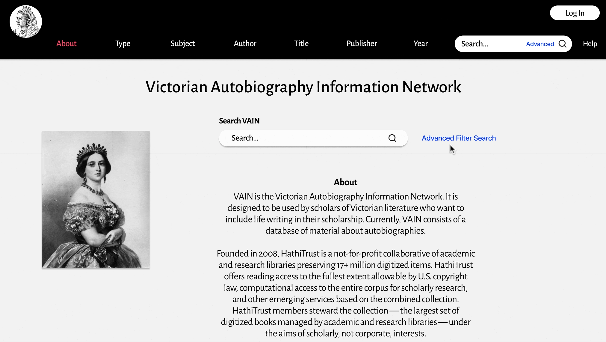
Since I was building a front end for a Victorian literature database, I wanted the design elements to be reminiscent of the Victorian era. I looked up Victorian era typography and colors to get ideas. I ended up choosing red as one of the main colors because it was supposedly Queen. Victoria’s favorite colors. The other Victorian colors can be seen throughout the visualizations.

Prototype.
I created some initial wireframes to organize my ideas and the information architecture. Then, based on some of my research, I created a design system. Based on the features I decided to focus on, I came up with the flows I wanted to make hi fi prototypes for. I then began working on the hi fi prototypes.
This

Wireframes

Design System
Hi Fi Prototype

Overview
Search through the subjects page
Users may follow the tutorial & canned questions to learn how to use the website and what type of questions can be answered on the “Subjects” page.


Browse literature
Once done browsing metadata, users can browse literature that aligns with the selected metadata filters.

Clearing filters
Easy way to clear the selected filters on the visualizations.
Loading page
The search function will take users to the loading page while it looks for results. It’s important to have a loading page that offers some explanation for what the user is waiting for.

Advanced filter search & empty search
Showing how to use the advanced search function and then what it looks like when a search comes up empty. It’s important to have a page that explains why there are no results and how the user might remedy the issue.

Logging in
Logging in as a user rather than browsing as a guest. The user has different abilities than a guest, such as ability to edit using a menu interface (as seen directly below).
Editing interface
The editing menu interface is available to users who are logged in. It allows users to submit changes of the metadata of a certain piece of literature.


Submitting an edit
Once the user has provided the information they want to, they may submit an edit for approval.
Reflections.
What I learned
Thoroughly understand the problem beforehand: I should have tried to clarify right away what my professor was looking for. Instead, I assumed I understood and wasted time on designs that I didn't end up using.
What could be improved
The design itself could use a lot more work and refinement. I had very little time to create what I did. I also wish there was time to do usability testing on it.
More concern toward accessibility features
I find typography to be the most difficult part of design. I changed my mind about the typography in this project probably 10 times. I need to read and educate myself on it so I can make quicker decisions.
This
Next Steps.
my design is being used for the real VAIN website
I’m waiting to hear back from them about what changes need to be made and will make those changes when I know.
the next step in the design process would be testing
This